Blog
Colour tips for painting a Babyclon®
Feb
In this first post we wanted to make a contribution of interesting information for all those artists who work customising and painting our sculptures, giving tips on the use of colours during the painting process. Our general manager Cristina Iglesias, who has been recognised for her artistic quality in the discipline of painting, reveals a trick about colour theory:
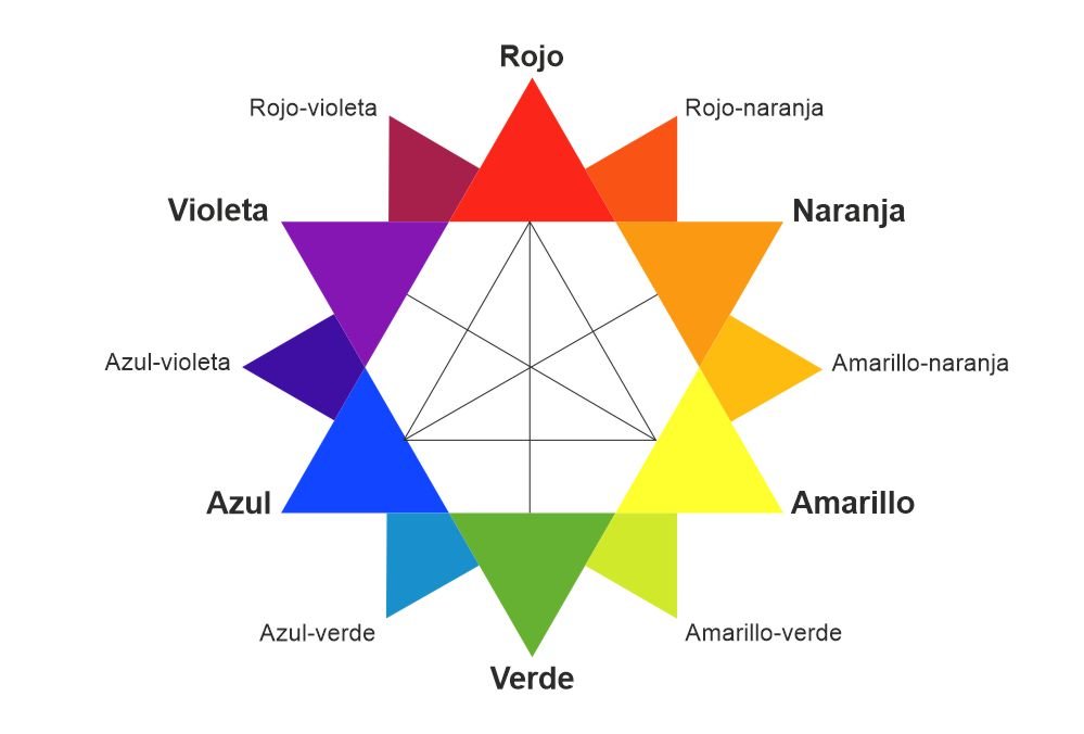
“Oswald’s star”.
This star will be from today a great reference for all those people who did not know it. This star shows all the primary and secondary colours from which all the colours we know are born. To understand this star in a simple way, we will separate the colours into three blocks: primary colours, secondary colours and complementary colours.
Primary colours.
The three primary colours are yellow, magenta and cyan. All other colours we know come from these three colours.
The addition of these three primary colours gives the colour black. Since it is very difficult to mix these three colours by hand in equal parts and in an exact way, when we make a combination of these three colours we do not get a pure black colour, but a very dark grey or brown colour. This is because the quantities of each colour used are not exactly the same.
The absence of these three primary colours (if we do not use any of them) is the colour white.
The primary colours are always used to tone different areas of the body. For example, red is used for the cheeks, nose flaps, eyelids, knees, etc.; yellow for the tip of the nose, dark circles under the eyes, etc. And cyan colour is used for the rectum, the corners of the lips, the septum, etc. We must always bear in mind that in no case should these colours be pure. . They should be mixed with other colours instead.
Secondary colours.
Secondary colours are the mixture between two primaries. In Oswald’s star, we find them between the primary colours, of which they are composed (Example: the colour green is composed of the colours blue and yellow and therefore Oswald’s star is between these two primary colours).
When it comes to paint, this helps us to create different tones and shades. For example, if we want an orange colour, we know that we must mix the colours yellow and magenta equally as the colour orange lies between these two primary colours. Therefore, we can say that orange is the secondary colour of yellow and magenta. Also, if we want a more reddish orange colour, we will have to add more magenta and less yellow.
With this pattern we can make as many colours as we want.
Complementary colours.
The complementary colours provide us with great solutions when it comes to correcting the tonalities of our paintings. It is very easy to identify them in Oswald’s star as they are placed opposite each other.
There are two very interesting concepts about complementary colours:
-Complementary colours placed side by side enhance each other. This means that if we put a red next to a green, these two colours will look much more powerful than if we put, for example, a green next to a blue (green and blue are not complementary colours, but a primary colour and its secondary colour).
-Overlapping complementary colours cancel each other out. They are colours that cannot be mixed on a base, except to cancel them out.
This point is very interesting when it comes to painting as it allows us to correct unwanted shades. For example, if our wrist is too red, this red could disappear by applying a light greenish tone on it. Obviously, the amount of green colour would only be a little, as the layer of green colour we should apply should be very translucent. It would have to be a very thin layer. Otherwise, we could spoil all the paint.
Another example would be, for example: if our doll had become too yellow, by applying a light layer of violet, the yellowish tone would disappear.
With this pattern, we can correct all the shades we want.
We hope this contribution will help you. We will continue to publish posts that might be useful for you when making your creations. In the next post we will explain colour saturation. This is another fundamental concept when making your own colour samples.